
Page 46 - Computer Class 08
P. 46
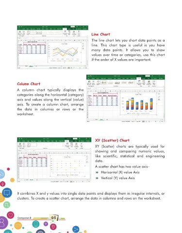
Line Chart

                                                                  The line chart lets you chart data points as a
                                                                  line.  This  chart  type  is  useful  is  you  have

                                                                  many  data  points.  It  allows  you  to  show
                                                                  values over time or categories, use this chart
                                                                  if the order of X values are important.


             Column Chart

             A  column  chart  typically  displays  the
             categories along the horizontal (category)

             axis and values along the vertical (value)
             axis.  To  create  a  column  chart,  arrange
             the  data  in  columns  or  rows  or  the
             worksheet.


                                                                     XY (Scatter) Chart
                                                                     XY  (Scatter)  charts  are  typically  used  for
                                                                     showing  and  comparing  numeric  values,

                                                                     like  scientific,  statistical  and  engineering
                                                                     data.
                                                                     A scatter chart has two value axis–

                                                                     8 Horizontal (X) value Axis
                                                                     8 Vertical (Y) value Axis


             It combines X and y values into single data points and displays them in irregular intervals, or
             clusters. To create a scatter chart, arrange the data in columns and rows on the worksheet.


              Computer-8             46