
Page 45 - Computer Class 08
P. 45
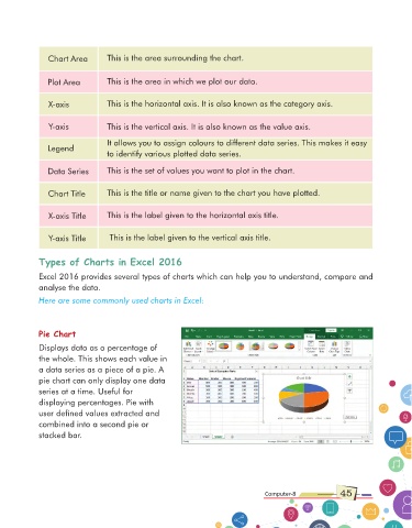
Chart Area         This is the area surrounding the chart.


                Plot Area          This is the area in which we plot our data.


                X-axis             This is the horizontal axis. It is also known as the category axis.


                Y-axis             This is the vertical axis. It is also known as the value axis.

                                   It allows you to assign colours to different data series. This makes it easy
                Legend
                                   to identify various plotted data series.

                Data Series        This is the set of values you want to plot in the chart.


                Chart Title        This is the title or name given to the chart you have plotted.


                X-axis Title       This is the label given to the horizontal axis title.


                Y-axis Title        This is the label given to the vertical axis title.


             Types of Charts in Excel 2016


             Excel 2016 provides several types of charts which can help you to understand, compare and
             analyse the data.
             Here are some commonly used charts in Excel:


             Pie Chart

             Displays data as a percentage of
             the whole. This shows each value in
             a data series as a piece of a pie. A
             pie chart can only display one data
             series at a time. Useful for
             displaying percentages. Pie with
             user defined values extracted and
             combined into a second pie or

             stacked bar.


                                                                                    Computer-8              45