
Page 169 - Maths Class 03
P. 169
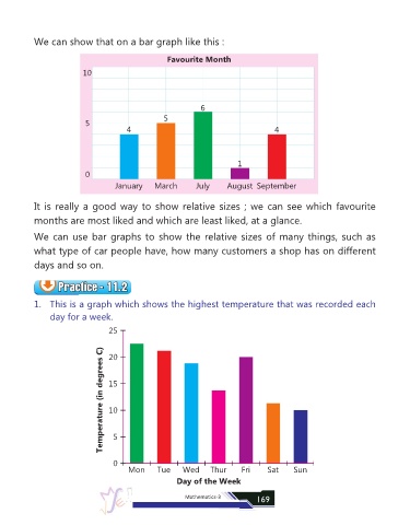
We can show that on a bar graph like this :

                                                      Favourite Month

                           10


                                                                6
                                                     5
                            5
                                         4                                              4


                                                                            1
                            0
                                     January      March        July      August September


            It is really a good way to show relative sizes ; we can see which favourite

            months are most liked and which are least liked, at a glance.

            We can use bar graphs to show the relative sizes of many things, such as

            what type of car people have, how many customers a shop has on different

            days and so on.


                    Practice - 11.2
                    Practice - 11.2
                    Practice - 11.2
                    Practice - 11.2
            1.  This is a graph which shows the highest temperature that was recorded each
                 day for a week.
                                   25


                                 Temperature (in degrees C)  15
                                   20


                                   10


                                     5


                                     0
                                          Mon      Tue     Wed     Thur      Fri      Sat     Sun
                                                         Day of the Week


                                                            Mathematics-3         169